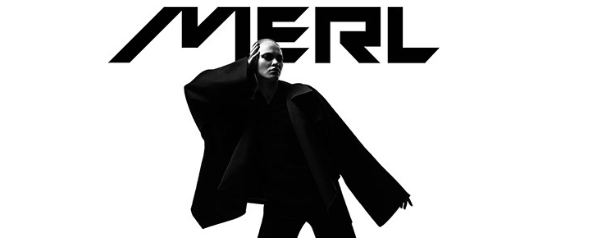
MERL.
The Brand
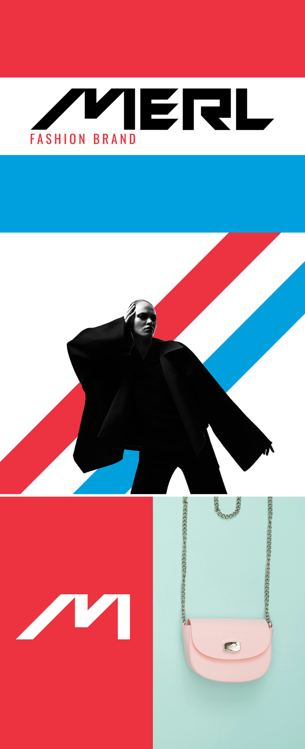
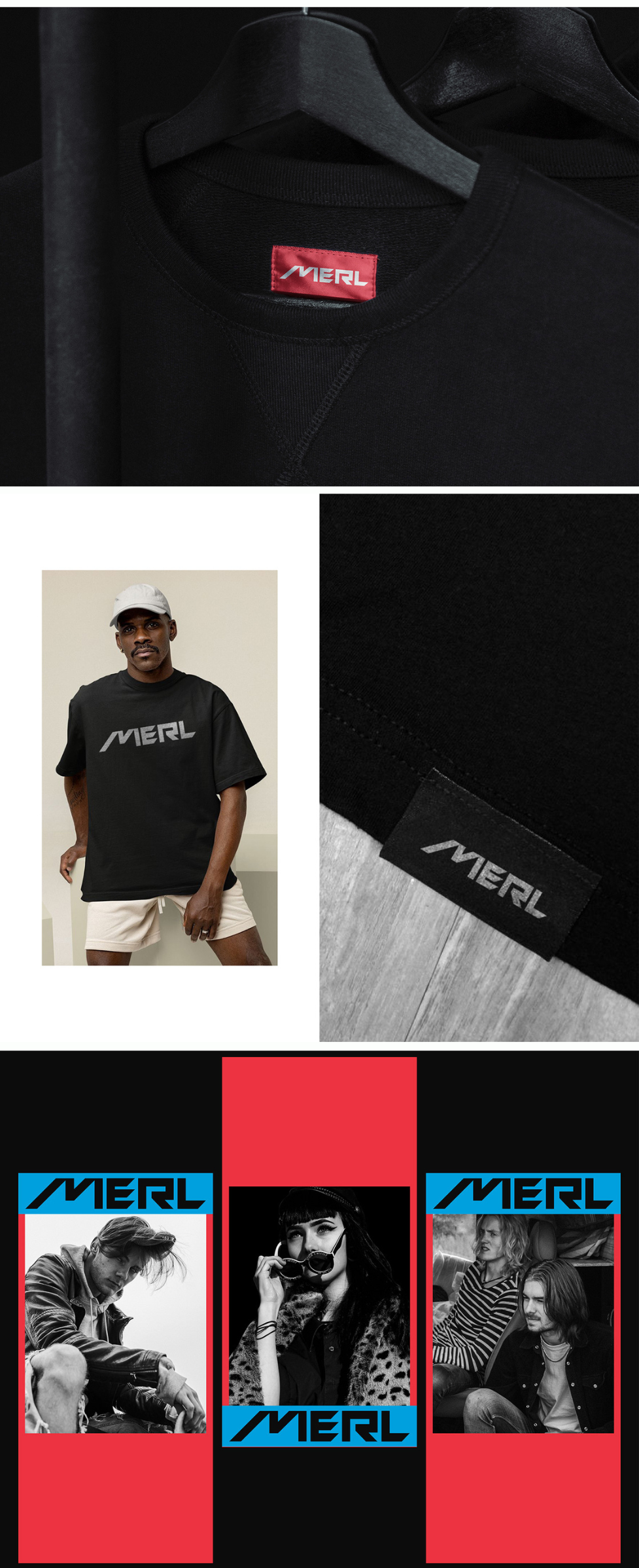
MERL, named after its founder Merl Bankhead, is a fashion brand that reflects a bold, modern identity through unique typography and design choices.
The Ask
Deliver a complete rebrand, focusing on fresh typography, packaging, and logo design that embody MERL’s essence.
The Approach
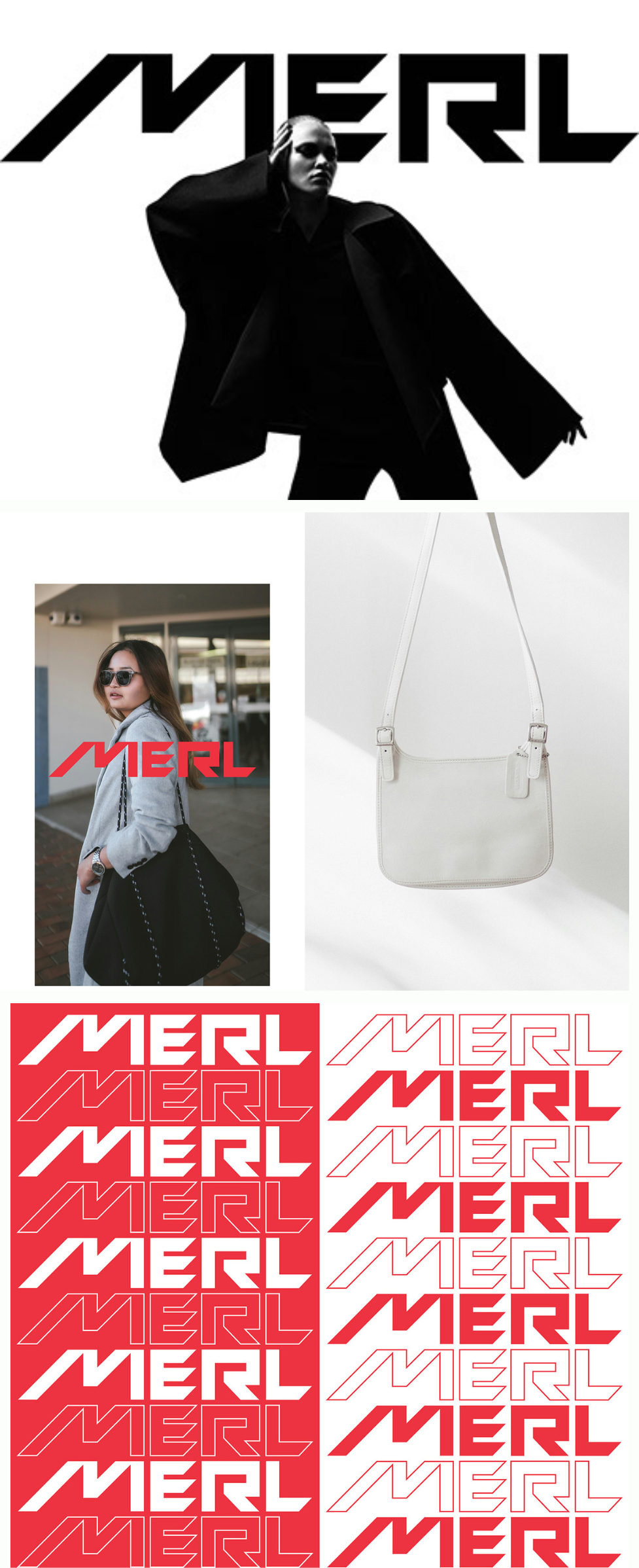
We began by understanding MERL’s origins and its founder’s personal story, channeling these elements into the rebrand. The decision to incorporate a Cyrillic accent into the typography was strategic. It pays homage to the founder’s unique flair while also distinguishing the brand from its previous Luxembourgish identity. This bold typographical shift was designed to modernize the brand and resonate with a global audience.
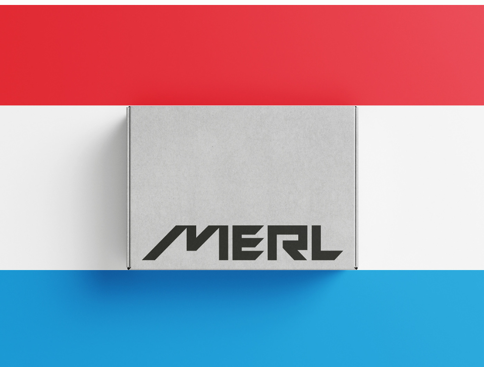
In the packaging design, we focused on creating a minimalistic yet elegant look, highlighting MERL’s sophisticated fashion lines. We integrated muted colors that communicate both exclusivity and accessibility, targeting fashion-forward customers who value both innovation and tradition.
Our logo design followed suit, employing sleek, geometric forms with a touch of contemporary style. This new logo, along with the revamped typography, set MERL apart in a crowded fashion market, offering a visual identity that reflects its new direction.
This entire approach is built around storytelling—crafting an authentic brand identity that matches the founder’s vision while also catering to a modern audience.
Scroll for visual delight:
